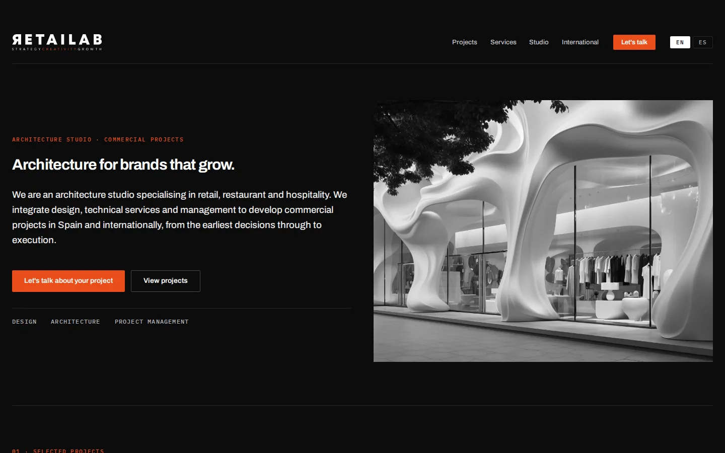
Editorial
Text and photograph in columns, closest to Concept 02.
Includes: Homepage and one project page, in Spanish and English.
Open Editorial
Website redesign · Third round · October 2026
Working from your guide of 27 September, we have developed the agreed direction: black background, light text and photography taking centre stage, with Concept 02's structure and Concept 01's typography. Every proposal uses the same content: your positioning as an architecture studio, your opening copy and the verified projects. What changes is the composition.
Start with the four compositions of the agreed direction and go through each from the opening to the contact section. The earlier explorations sit further down, in case a detail is worth keeping.
The project, service, method and team texts are our wording, for you to correct. The photographs come from your dossier. Índice Oscuro and the explorations are in Spanish; the English version will be prepared for the chosen one.
01 · The agreed direction
All four follow your guide: Concept 02's structure, Concept 03's black ground and photography, Concept 01's typography and orange as an accent only. Content and section order are the same; the composition changes.
Text and photograph in columns, closest to Concept 02.
Includes: Homepage and one project page, in Spanish and English.
Open Editorial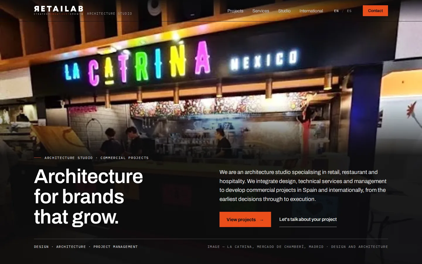
Full-bleed photography as the ground, with type over it; projects as full-width bands.
Includes: Homepage, projects, two project pages, services, studio, international and contact, in Spanish and English.
Open Cinematic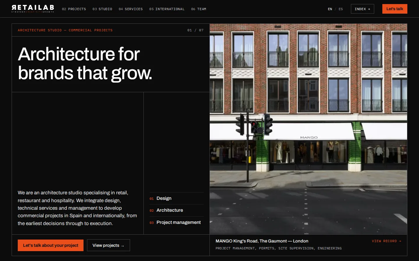
A ruled grid of records, like a working archive, with every project's location and scope in view.
Includes: Homepage, an index of all 16 projects and a record for each, in Spanish and English.
Open Archive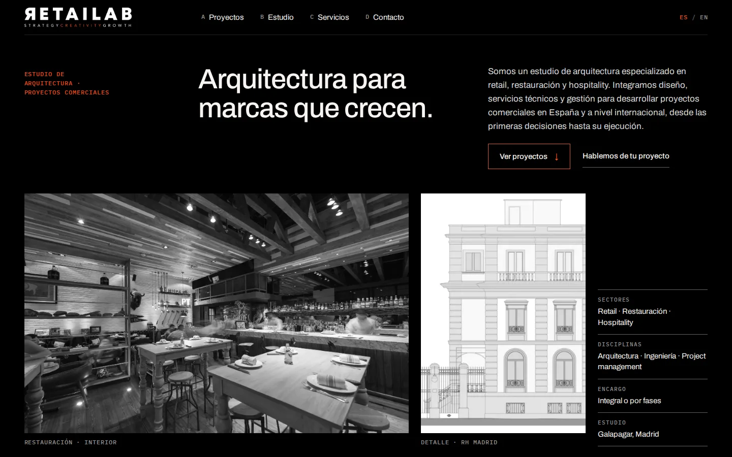
A project register: choose a project and its record opens. Desaturated photography.
Includes: Full homepage, in Spanish.
Open Índice Oscuro02 · Earlier explorations
Earlier versions, also on black, from the same family as Índice Oscuro. They are here in case a detail is worth carrying into the chosen one.
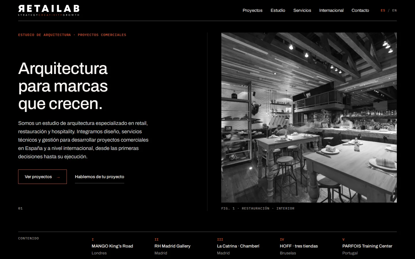
Second version of the Folio family.
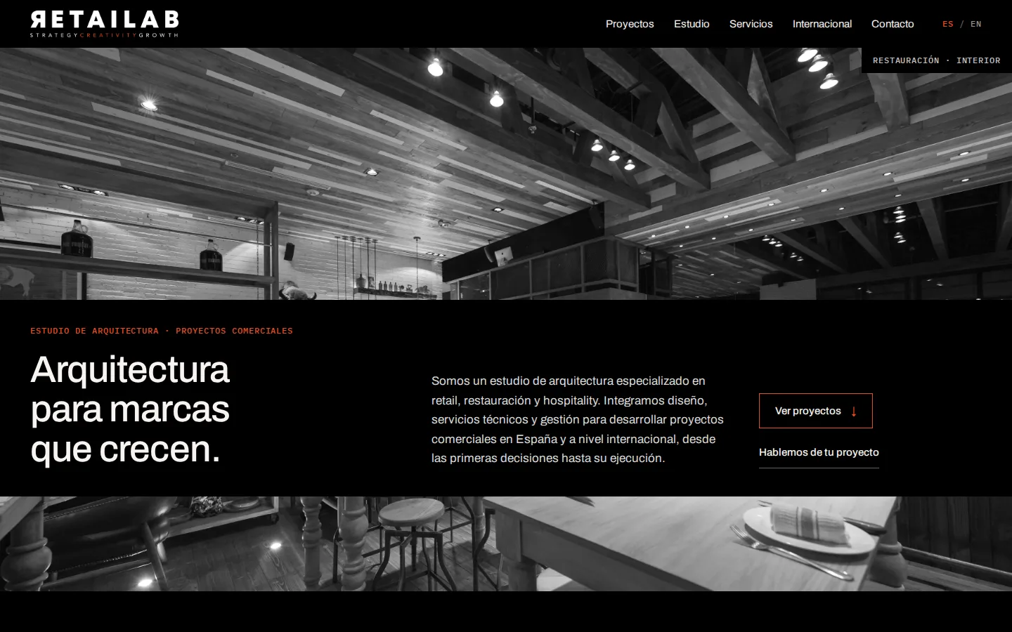
Second version of the Encuadre family.
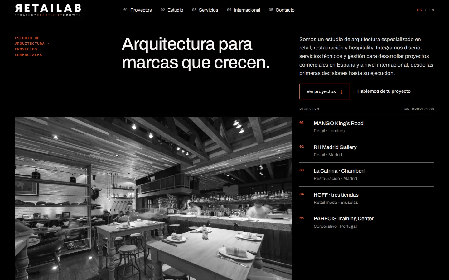
Second version of the Índice family.
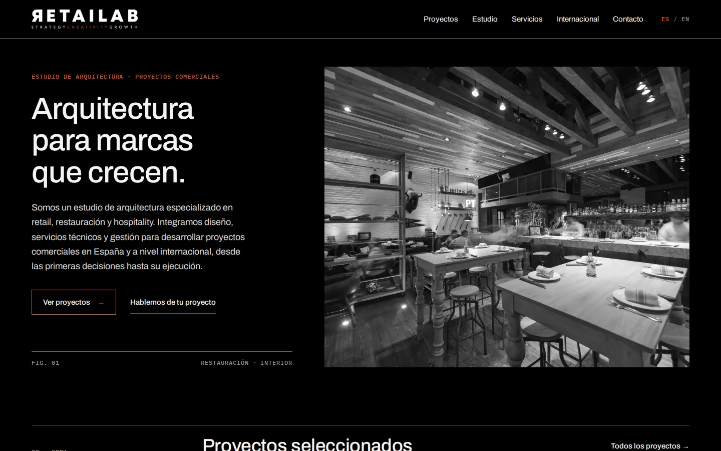
First version of the Folio family.
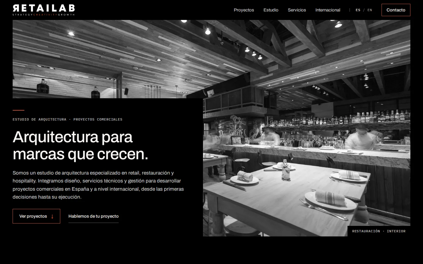
First version of the Encuadre family.
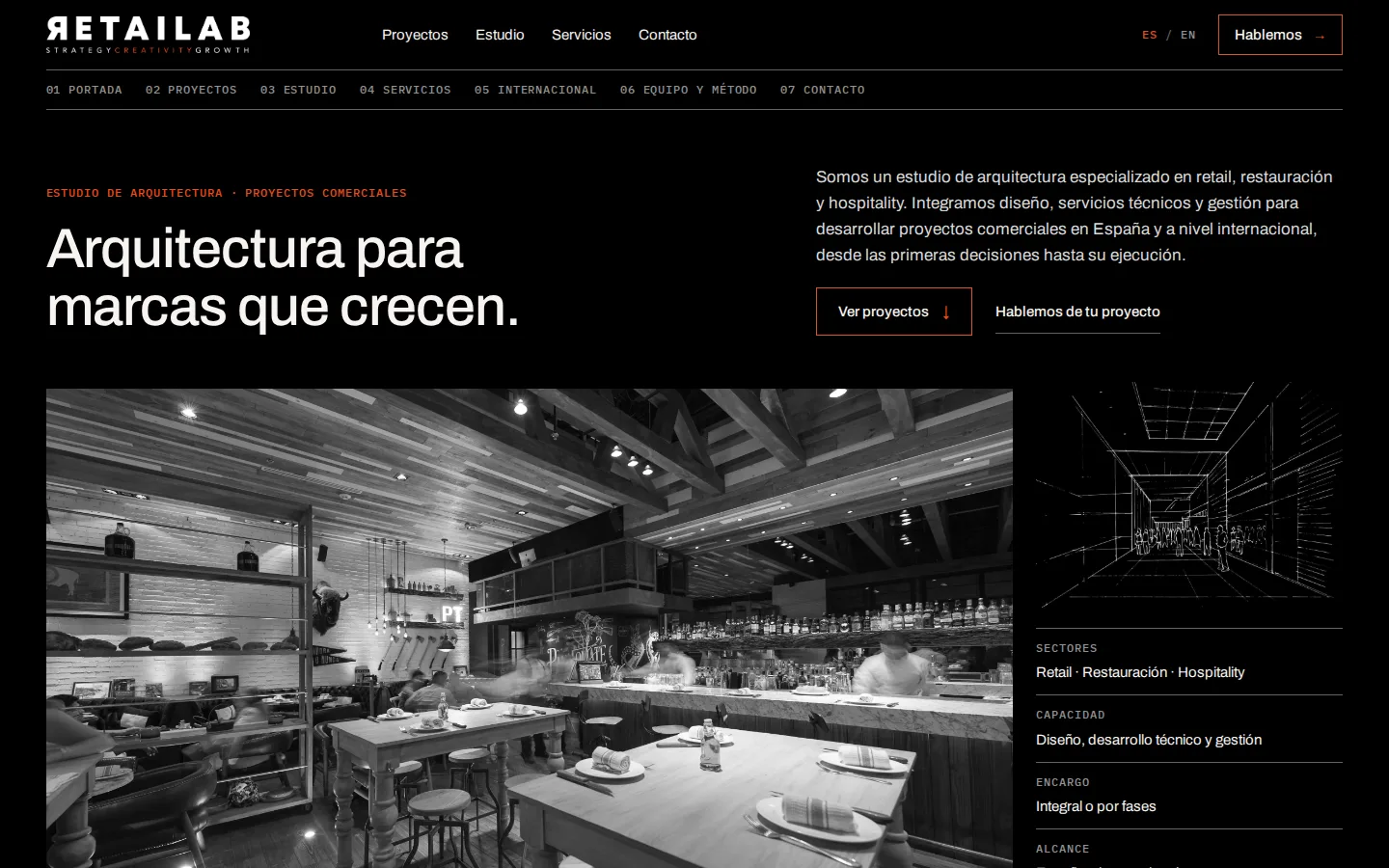
First version of the Índice family.
03 · Common ground
These come from your guide and do not change between proposals.
04 · Comparison
| Composition | Reading | Photography | Ideal when | |
|---|---|---|---|---|
| Editorial | Text and photograph in columns | Ordered | Colour | You want Concept 02's structure as it is |
| Cinematic | Full-bleed photography, type over it | Unhurried, immersive | Colour | Quality photography exists for every project |
| Archive | Ruled grid of records | Quick, informative | Colour | You want many projects shown with their scope in view |
| Índice Oscuro | Project register with records | Selective | Desaturated | You prefer a compact homepage, one project at a time |
05 · Decision
Your answer lets us settle on a single version and build the remaining pages.
06 · Material
To complete the website we need the following material.
First round · Reference
The agreed direction came from these. They remain here for reference.
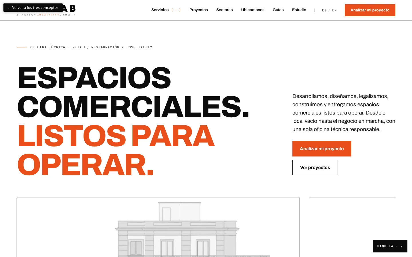
Concepto 01 · Dossier editorial
A technical dossier turned into a portfolio: clear information, rigorous attribution and room to explain scope, method and experience.
The strongest direction for documenting projects in technical detail.
Open the concept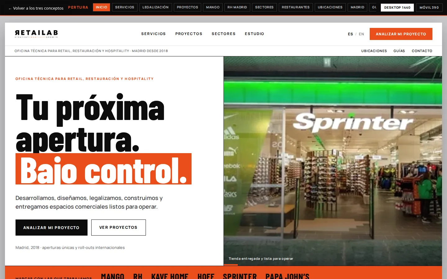
Concepto 02 · Apertura
Direct typography, strong contrast and a journey that takes visitors from their opening stage to a concrete conversation.
The most immediately understood direction, and the most oriented towards enquiries.
Open the concept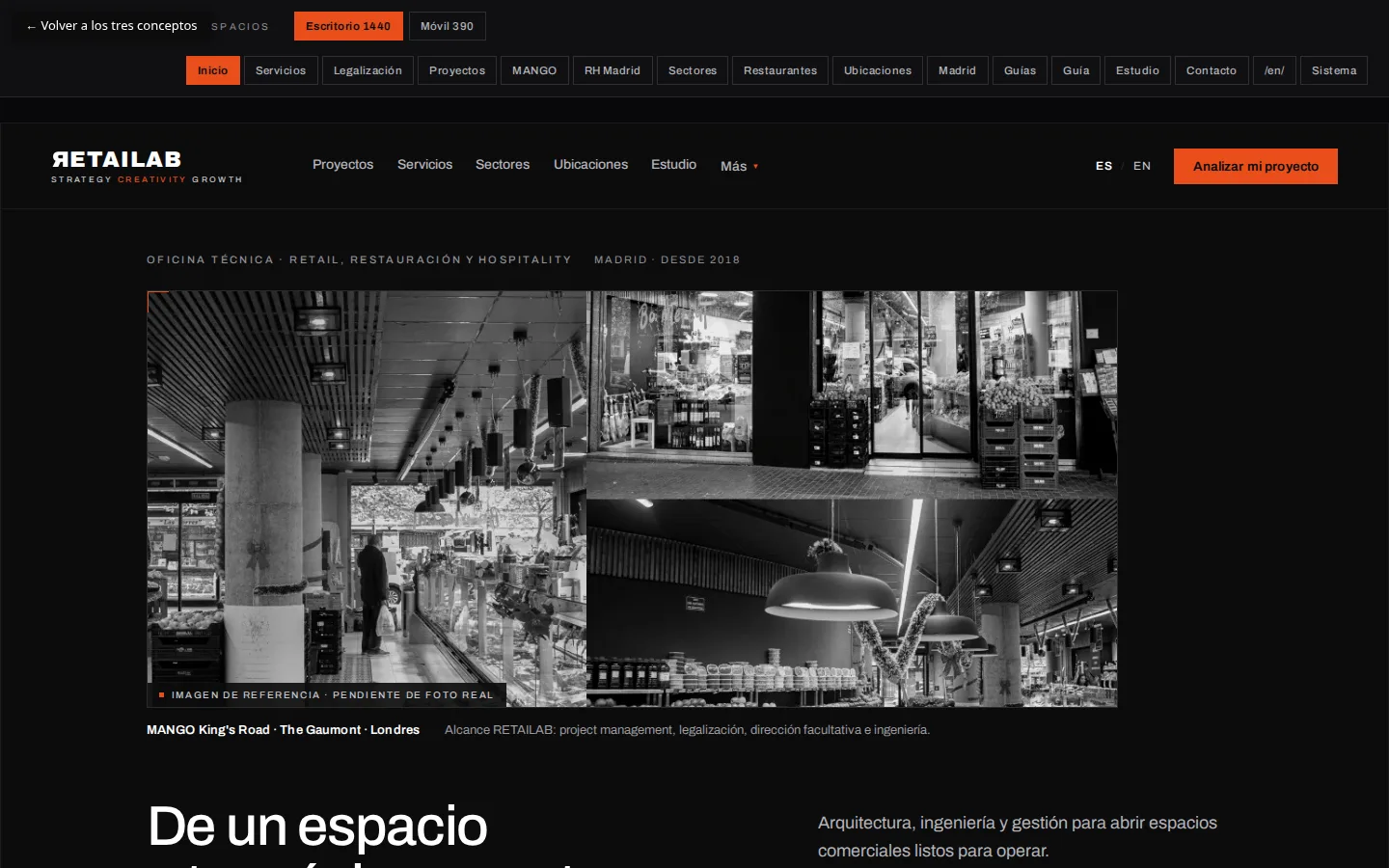
Concepto 03 · Espacios
A dark, composed presence led by projects and photography, expressing international experience and attention to detail.
The strongest brand presence, provided high-quality photography is available.
Open the concept